If you take a look around, you’ll see that many businesses have terrible logos. In some cases, it’s clear the business didn’t put much thought into it. In other cases, the designer may have had good intentions but wasn’t skilled.
Emanuele Abrate, an Italian graphic designer, has come up with an interesting project in which he has redesigned the nine worst logos. Emanuele has tried to recreate these logos as if they were commissioned to him. He used different typography techniques, created aesthetic logomarks, and kept the brand colors close to the original.
Thankfully, there are graphic designers out there who can take these logos and turn them into something great. Here are nine examples of terrible logos that graphic designers fixed. Enjoy!
1. Mama’s Baking


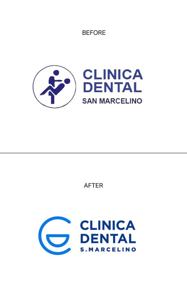
2. Clinica Dental


3. Fire Prevention Product


4. Safe Place


5. Office Of Government Commerce


6. Institute of Oriental Studies – Santa Catarina University


7. Kudawara Pharmacy


8. The Computer Doctors


9. Arlington Pediatric Center


What do you think? Which of these logos is the best, in your opinion, and what would you have done differently if it were yours to fix up? Let us know by commenting below. We’d love to hear from you!


